Lecture: Data Visualisation
Actuarial Data Science - Open Learning Resource
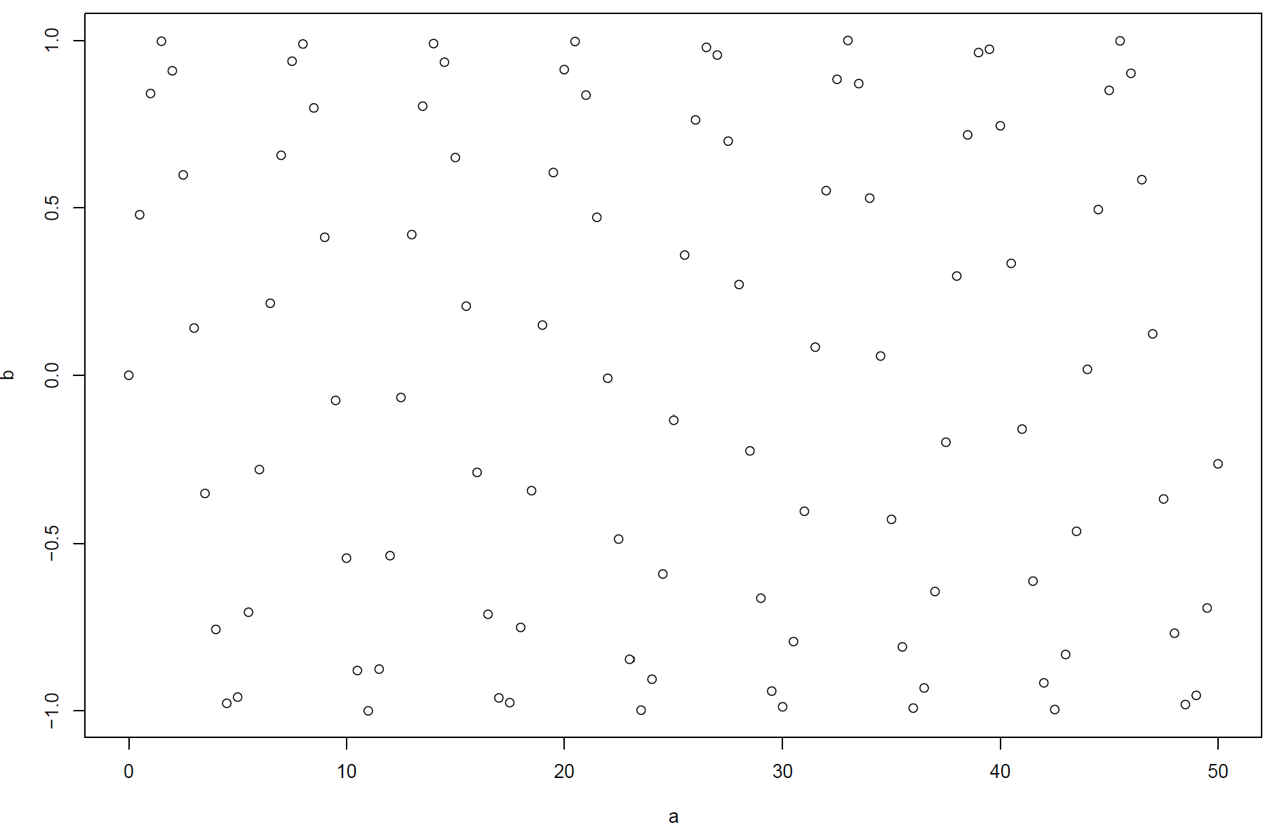
Seeing Patterns in Data
- What patterns can you see in this plot?
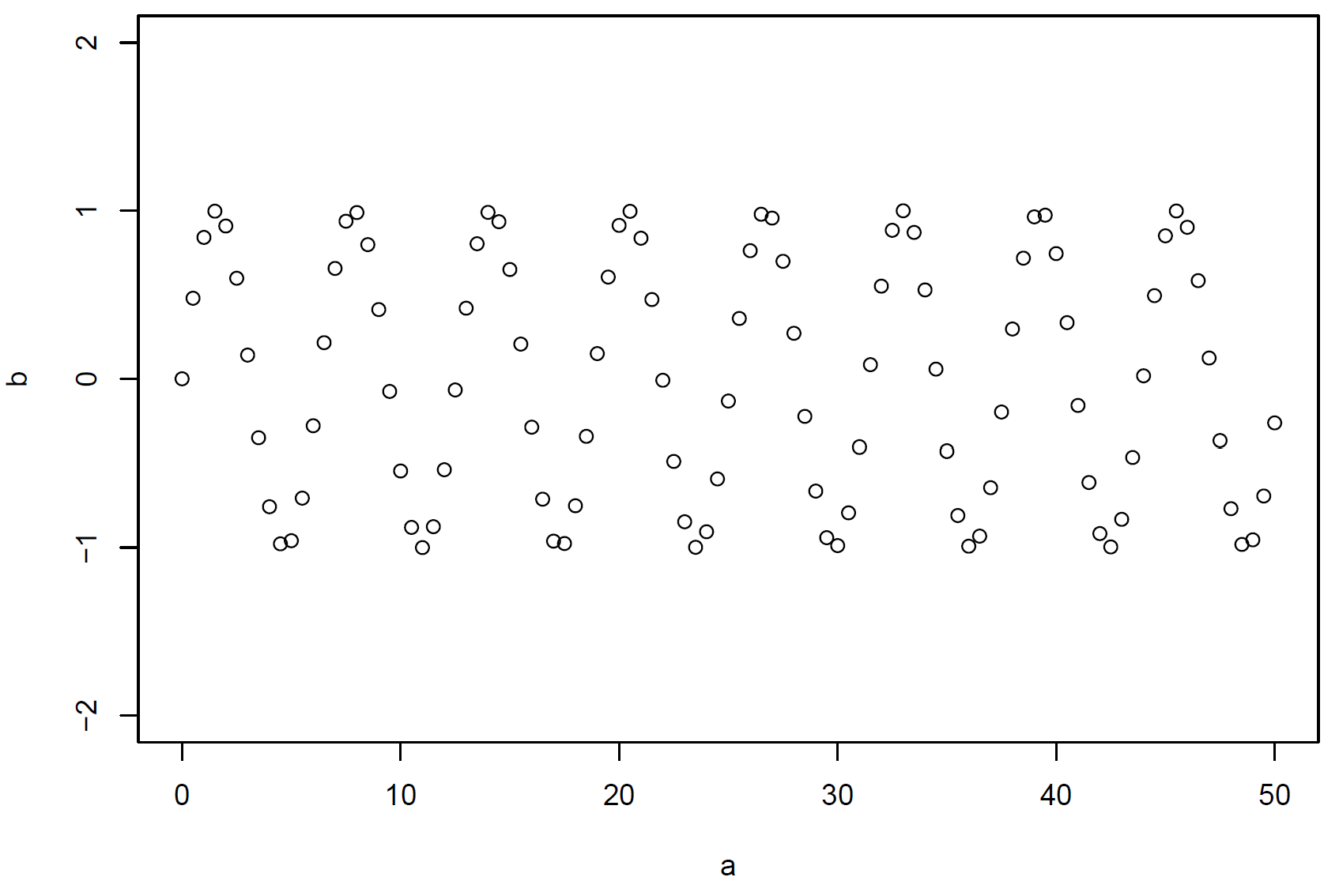
Seeing Patterns in Data (continued)
- What patterns can you see in this plot?
Creating a Plot
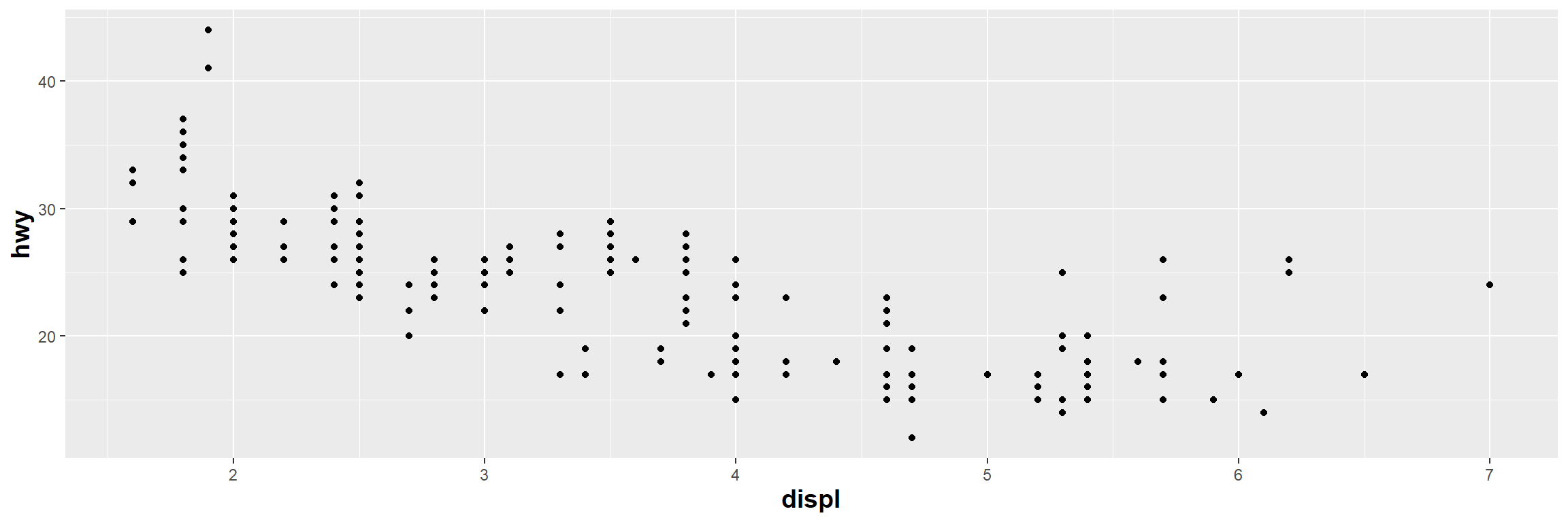
See also: A complete ggplot “sentence”; Local mpg plot
Method 1: Declare Data Inside ggplot()

Method 2: Use the Pipe Operator
- Pipe data into
ggplot()using the pipe operator%>%

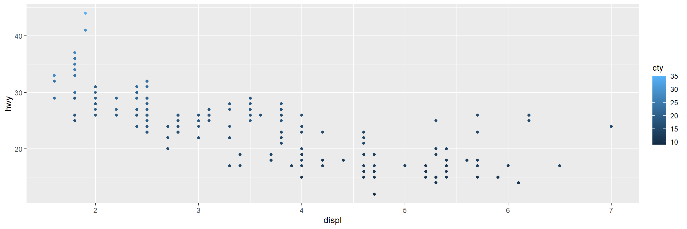
Common Aesthetic Mappings
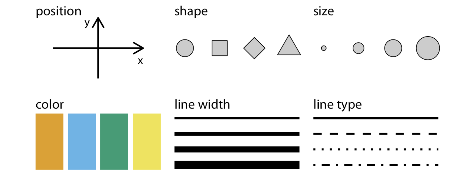
A main pool of aesthetics (Source: Wilke (2019), Fundamentals of Data Visualization)
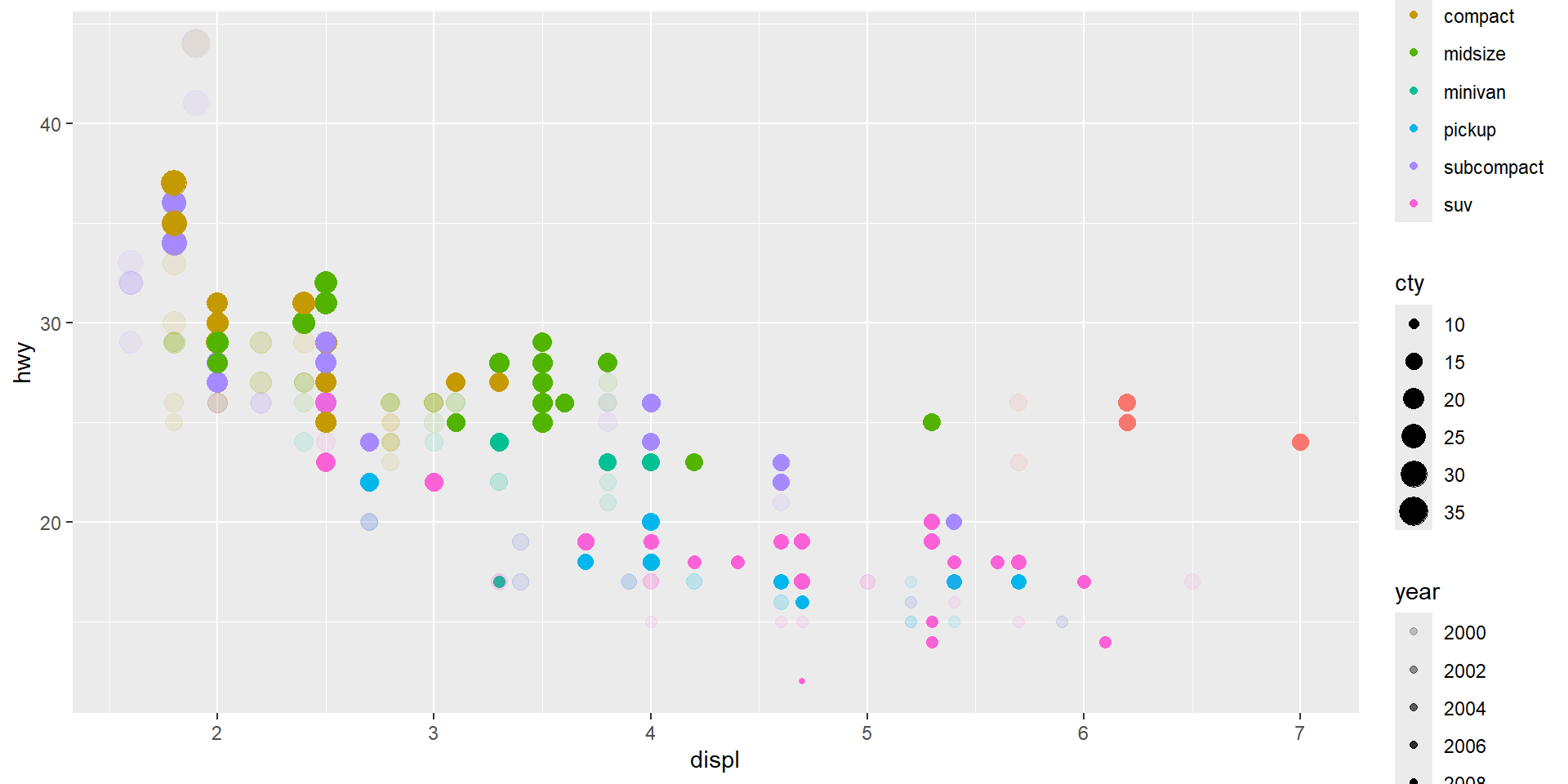
Example: Multiple Aesthetic Mappings
Aesthetic Mappings for Different Geoms
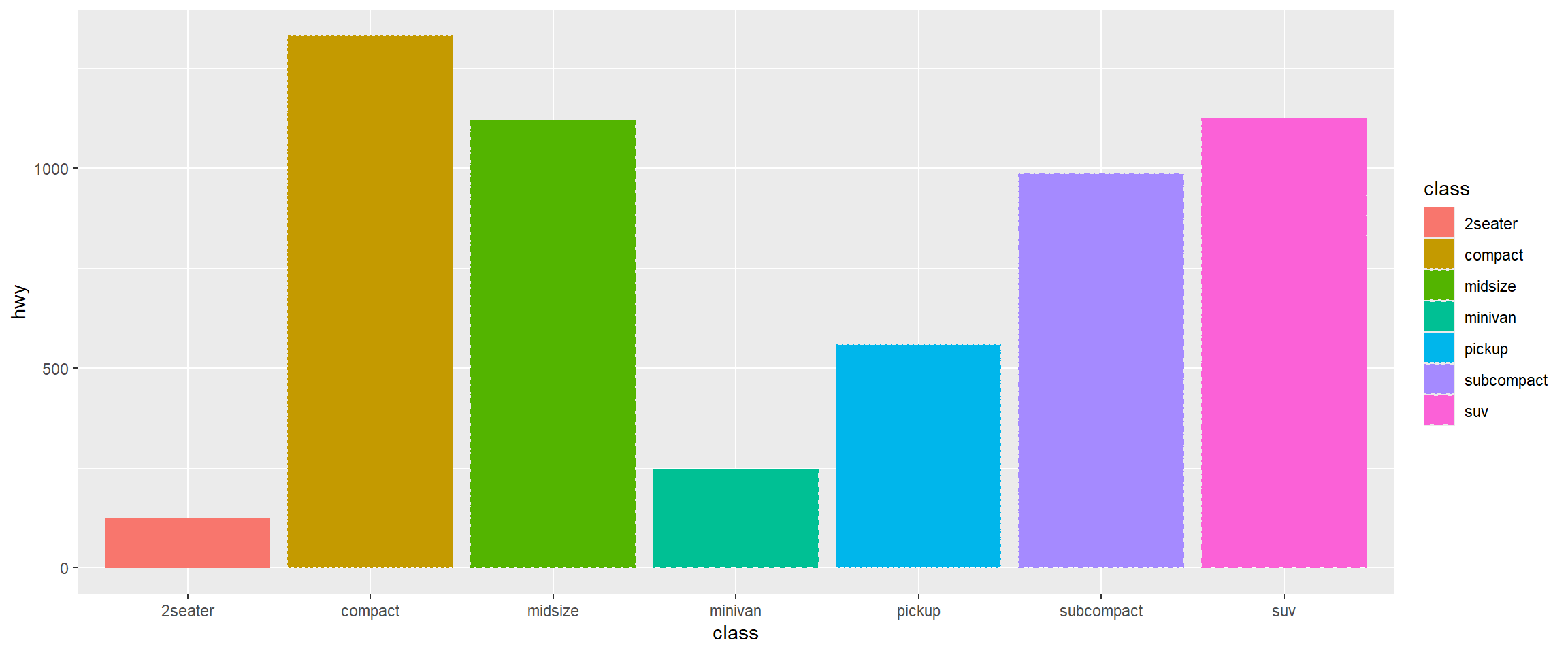
Different geometric objects use different aesthetic properties. For example, column plots often use fill to distinguish groups.
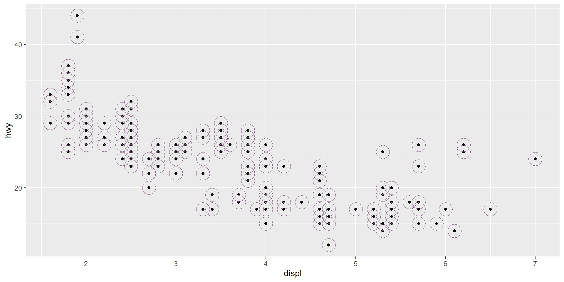
Plot: Unmapped Aesthetics
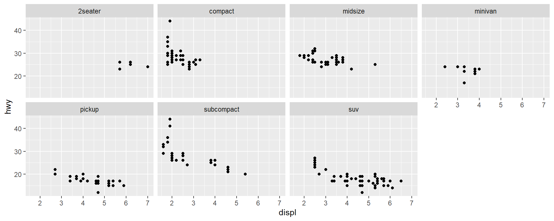
Using facet_wrap()
- Facet your plot by a single variable
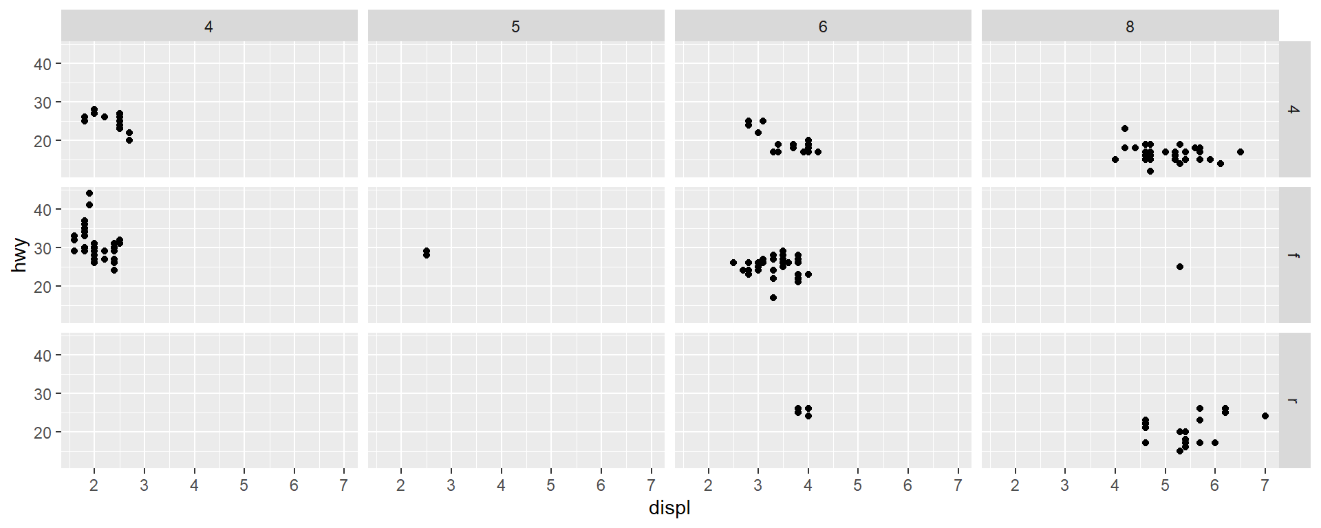
Using facet_grid()
- Facet your plot by the combination of two variables
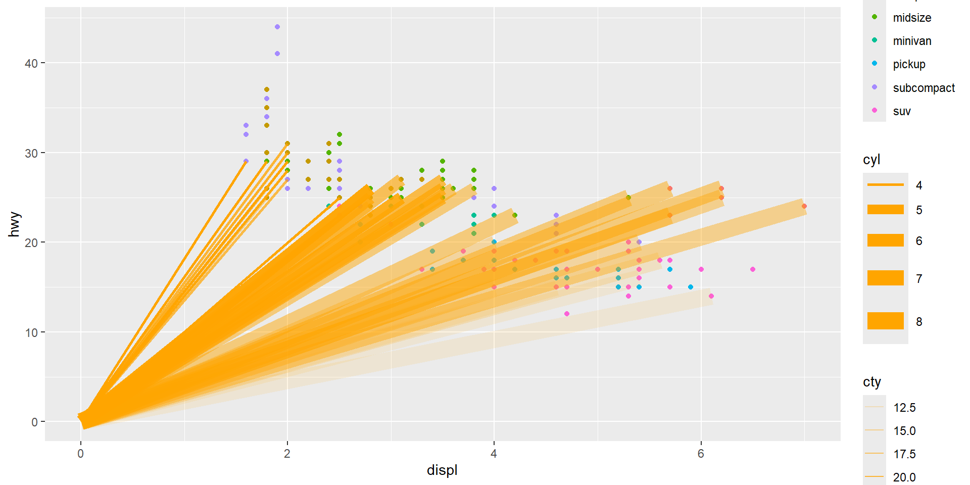
Different Geoms
Compare with mpg plot
library(grid)
library(gridExtra)
# Create scatter plot with points
scatter_plot <- ggplot(data = mpg) +
geom_point(mapping = aes(x = displ, y = hwy))
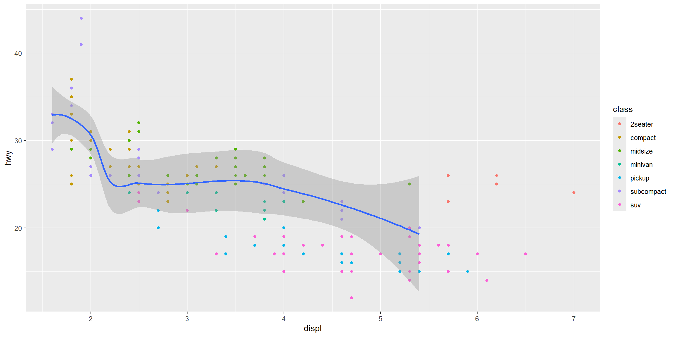
# Create smooth line plot with different linetypes by drive type
smooth_plot <- ggplot(data = mpg) +
geom_smooth(mapping = aes(x = displ, y = hwy, linetype = drv), se = FALSE)
# Arrange both plots side by side
grid.arrange(scatter_plot, smooth_plot, ncol = 2)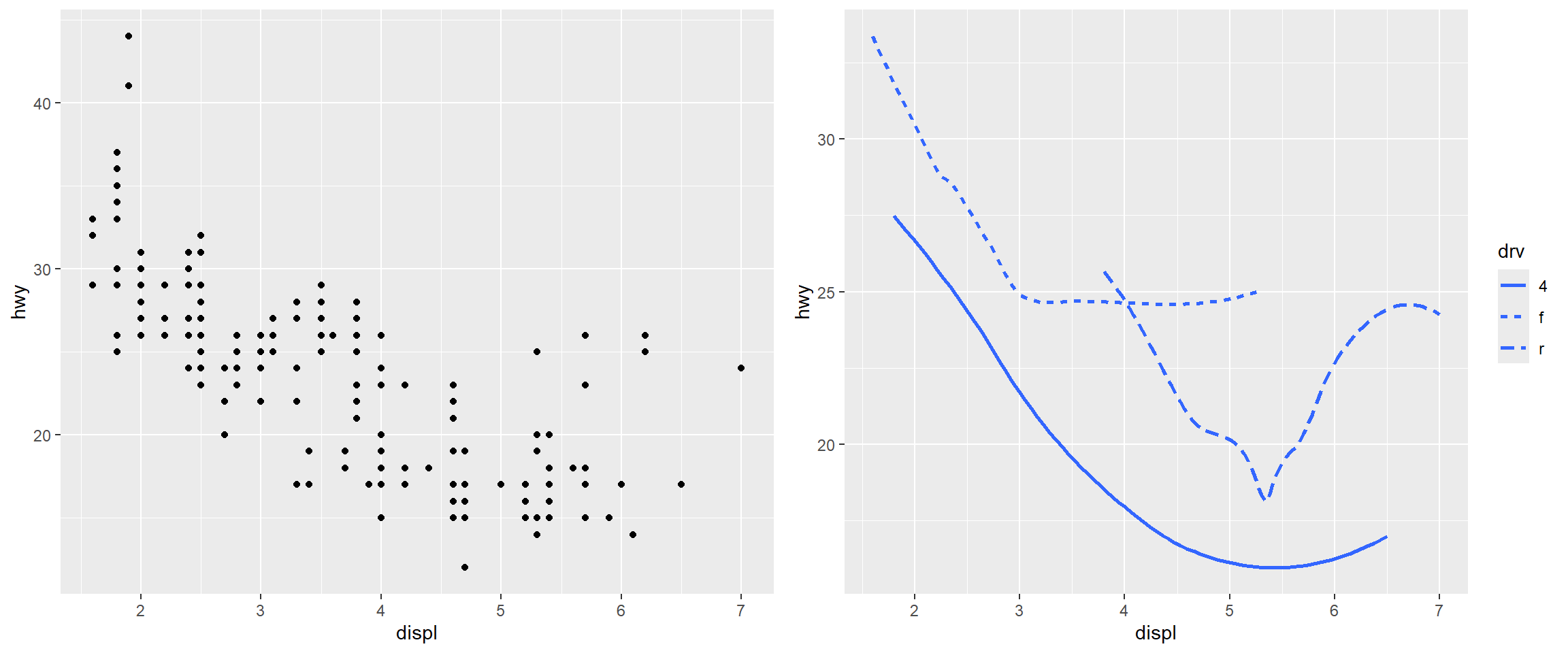
Example: Boxplots
# Boxplot with default orientation (vertical)
boxplot_vertical <- ggplot(data = mpg, mapping = aes(x = class, y = hwy)) +
  geom_boxplot()
# Boxplot with flipped axes (horizontal)
boxplot_horizontal <- ggplot(data = mpg, mapping = aes(x = class, y = hwy)) +
  geom_boxplot() +
  coord_flip() # switches the x and y axes
# Arrange both plots side by side for comparison
grid.arrange(boxplot_vertical, boxplot_horizontal, ncol = 2)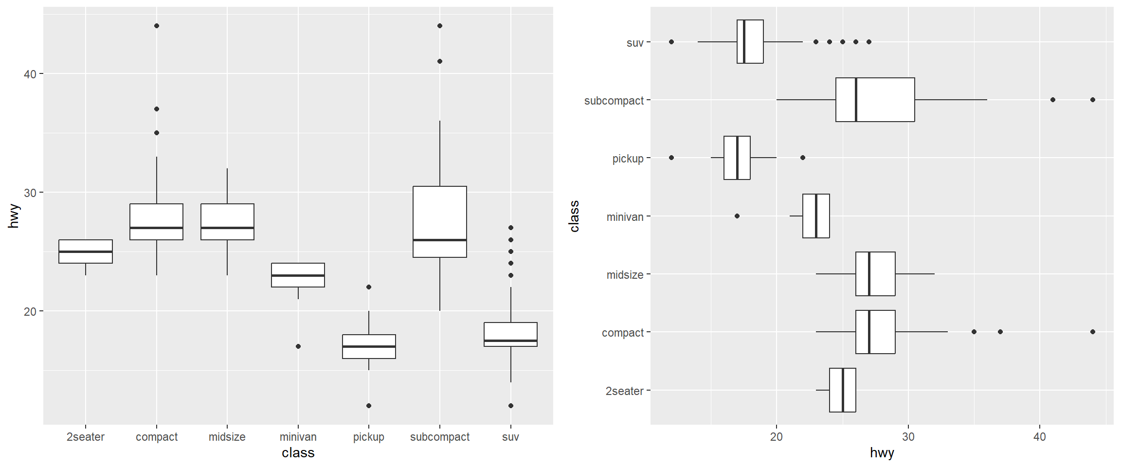
Result: Local Data and Aesthetic Mappings
Example: Local Aesthetic Mappings
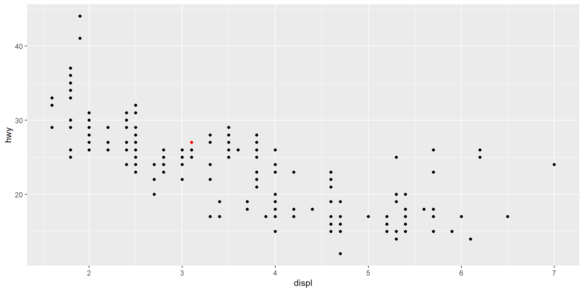
Result: Highlighting a Point
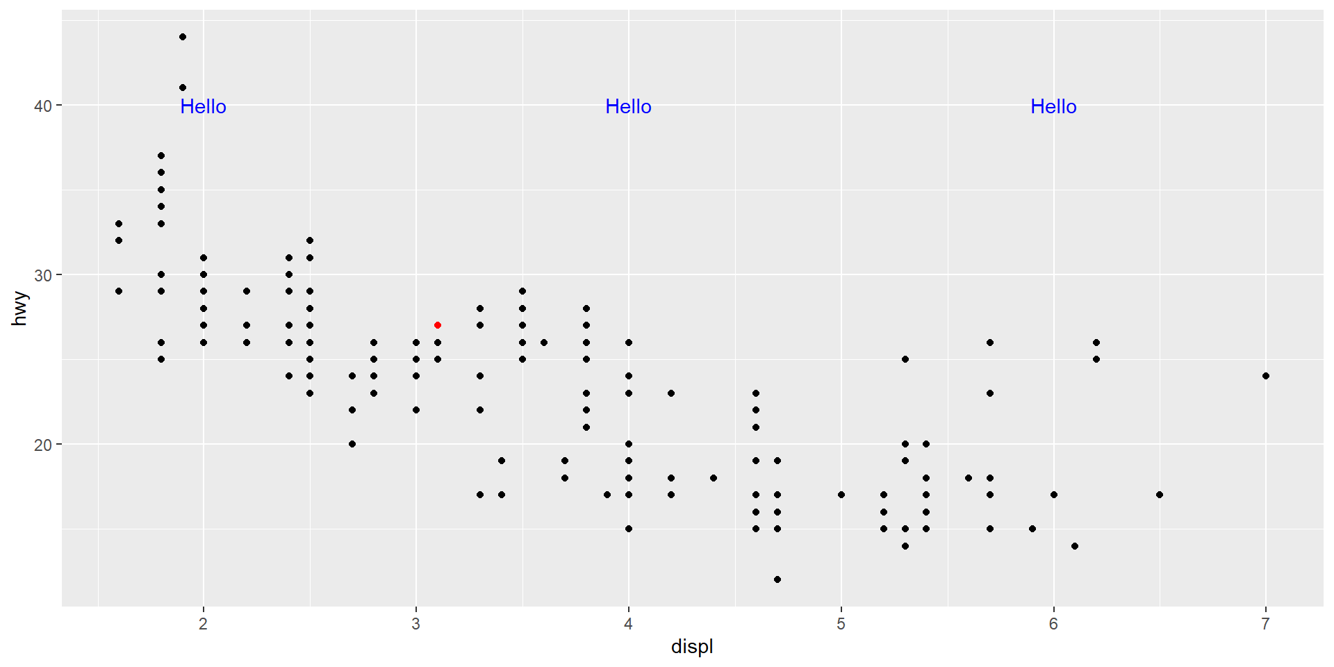
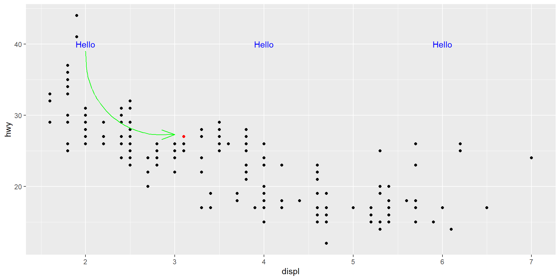
Result: Adding Text
Result: Adding a Curved Arrow
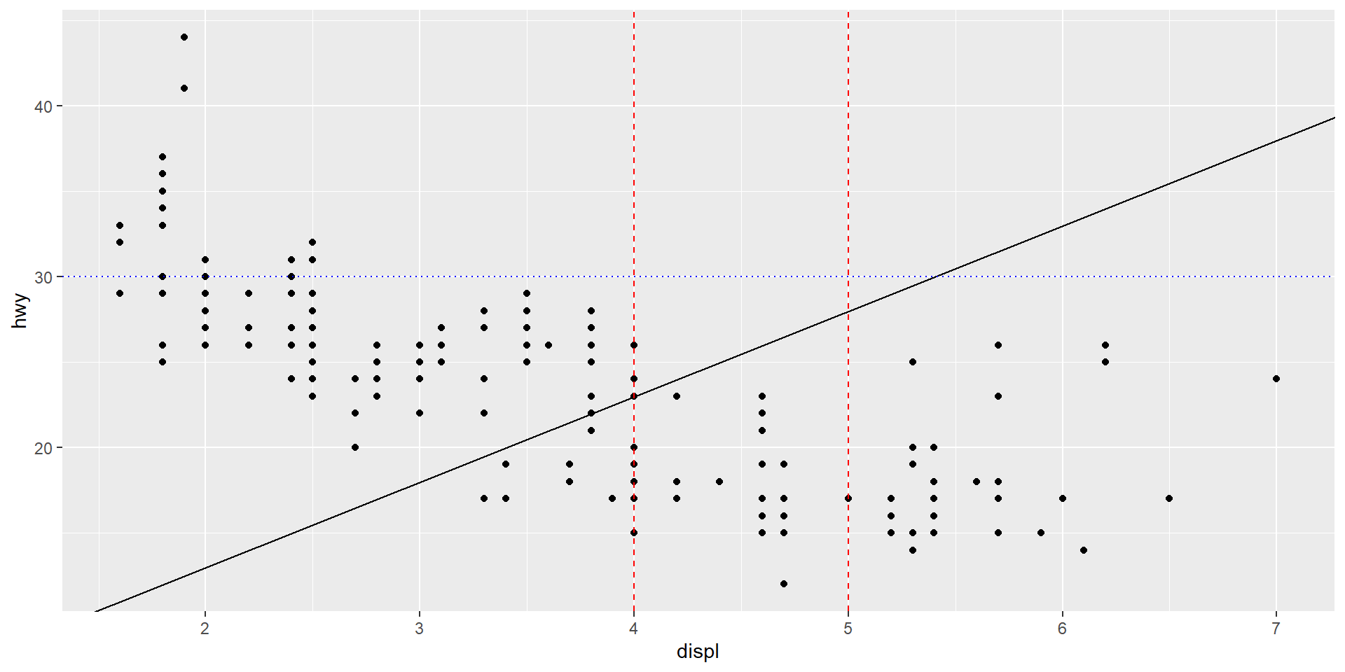
Result: Adding Reference Lines
References
![]()
Wickham, Hadley, Mine Çetinkaya-Rundel, and Garrett Grolemund. 2023. R for Data Science: Import, Tidy, Transform, Visualize, and Model Data. 2nd ed. O’Reilly Media.
Wilke, Claus O. 2019. Fundamentals of Data Visualization: A Primer on Making Informative and Compelling Figures. O’Reilly Media.