Lecture: Data Quality Check and Cleaning

Actuarial Data Science - Open Learning Resource

Fei Huang, UNSW Sydney

Tibbles

Tibbles

  • We work with “tibbles” instead of R’s traditional data.frame in the tidyverse environment.
  • The tibble package provides opinionated data frames that make working in the tidyverse easier.
  • See vignette("tibble") for more information.

This lecture focuses on data quality: how to store your data in a tidy, convenient format, and how to identify and fix common data issues before they silently undermine your analysis. The aim is that by the end, you feel more confident trusting the datasets you work with, or at least knowing when you should not trust them yet.

#install.packages("tidyverse")
library(tidyverse)

Creating Tibbles

  • Convert a data frame to a tibble: as_tibble()
  • Create tibbles: tibble()
  • Use non-syntactic names with backticks
  • tribble(): create tibbles in a transposed format

Example: Converting to a Tibble

as_tibble(iris)

Example: Creating a Tibble

tibble(
  x = 1:5, 
  y = 1, 
  z = x ^ 2 + y
)

Example: Creating Tibbles with Special Names

tibble(
  `:)` = "smile", 
  ` ` = "space",
  `2000` = "number"
)
tribble(
  ~x, ~y, ~z,
  #--|--|----
  "a", 2, 3.6,
  "b", 1, 8.5
)

Pipe Data using %>%

  • Use %>% to emphasise a sequence of actions rather than the object being acted on
  • Pronounce %>% as “then” when reading code
  • No need to create intermediate objects
  • %>% should always have a space before it and is usually followed by a new line.
iris %>%
  group_by(Species) %>%
  summarise(
    Sepal.Length = mean(Sepal.Length),
    Sepal.Width = mean(Sepal.Width),
    Species = n_distinct(Species)
  )

Tibble vs. Data Frame

  • tibble() does less:
    • it never changes the type of the inputs (e.g. it does not convert strings to factors)
    • it never changes variable names
    • it never creates row names
  • Printing
    • tibbles show only the first 10 rows
    • each column reports its type
    • use print() to display more rows (n) and columns (width)
  • Subsetting
    • extract a single variable using $ (by name) or [[ ]] (by name or position)
    • within a pipe %>%, use the special placeholder .

Examples: Extracting Variables from a Tibble

df <- tibble(
  x = runif(5),
  y = rnorm(5)
)
# Extract by name
df$x
[1] 0.06613743 0.64441979 0.87036981 0.99049084 0.76861869
df[["x"]]
[1] 0.06613743 0.64441979 0.87036981 0.99049084 0.76861869
# Extract by position
df[[1]]
[1] 0.06613743 0.64441979 0.87036981 0.99049084 0.76861869
df %>% .$x
[1] 0.06613743 0.64441979 0.87036981 0.99049084 0.76861869
df %>% .[["x"]]
[1] 0.06613743 0.64441979 0.87036981 0.99049084 0.76861869

Import Data

Import Data

Tidy Data

Tidy Data

  • The same data can be organised in different ways.
  • Tidy data is easier to work with.
  • There are three interrelated rules that make a dataset tidy:
    • Each variable has its own column
    • Each observation has its own row
    • Each value has its own cell
  • Practical guidelines:
    • Store each dataset as a tibble
    • Store each variable in its own column
  • dplyr, ggplot2, and other tidyverse packages are designed to work with tidy data
library(tidyverse)

Pivoting: Longer

  • A common problem occurs when column names represent values rather than variables.
  • Example: table4a
    • Column names (1999, 2000) represent values of the year variable
    • Values in these columns represent values of the cases variable
    • Each row represents two observations, not one
#table4a

table4a %>% 
  pivot_longer(cols = c(`1999`, `2000`), names_to = "year", values_to = "cases")

Pivoting: Wider

  • pivot_wider() is the opposite of pivot_longer()
  • Use it when a single observation is spread across multiple rows.
  • Example: table2
    • Each observation is a country in a given year
    • Data for each observation is spread across multiple rows
table2 %>%
    pivot_wider(names_from = type, values_from = count)

Separating

  • table3 has a different problem: one column (rate) contains two variables (cases and population).
  • separate() splits one column into multiple columns, by splitting wherever a separator character appears.
  • By default, separate() splits values at non-alphanumeric characters (i.e. characters that are not numbers or letters).
  • Use the sep argument to specify a custom separator.

 table3

Example: Using separate()

table3 %>% 
  separate(rate, into = c("cases", "population"), sep = "/")
#table3 %>% 
#  separate(rate, into = c("cases", "population"), sep = "/", convert=TRUE)

#table3 %>% 
#  separate(year, into = c("century", "year"), sep = 2)

Unite

  • unite() is the inverse of separate(): it combines multiple columns into a single column
  • By default, it places an underscore (_) between values from different columns
  • If no separator is desired, use sep = ""
table5 %>% 
  unite(new, century, year)
#table5 %>% 
#  unite(new, century, year, sep = "")

Missing Values

  • A value can be missing in one of two ways:
    • Explicitly: represented by NAthe presence of an absence
    • Implicitly: not recorded in the dataset – the absence of a presence
  stocks <- tibble(
  year   = c(2015, 2015, 2015, 2015, 2016, 2016, 2016),
  qtr    = c(   1,    2,    3,    4,    2,    3,    4),
  return = c(1.88, 0.59, 0.35,   NA, 0.92, 0.17, 2.66)
)

Making Implicit Missing Values Explicit

  • Use pivot_wider()
  • Use complete()
stocks %>% 
  pivot_wider(names_from = year, values_from = return)
#stocks %>% 
#  complete(year, qtr)

Making Explicit Missing Values Implicit

  • Set values_drop_na = TRUE in pivot_longer() to convert explicit missing values into implicit ones
stocks %>% 
  pivot_wider(names_from = year, values_from = return) %>% 
  pivot_longer(
    cols = c(`2015`, `2016`), 
    names_to = "year", 
    values_to = "return", 
    values_drop_na = TRUE
  )

Filling Missing Values with fill()

  • fill() replaces missing values with the most recent non-missing value (also known as last observation carried forward).
treatment <- tribble(
  ~ person,           ~ treatment, ~response,
  "Derrick Whitmore", 1,           7,
  NA,                 2,           10,
  NA,                 3,           9,
  "Katherine Burke",  1,           4
)

treatment %>% 
  fill(person)

Assessing Data Quality

Common Data Issues

  • Missing data
  • Irregular data and outliers
  • Uninformative data
  • Censored and truncated data
  • High cardinality features
  • Imbalanced data

Diagnosing Missing Data

Missing Data

  • Understand why values are missing
  • Distinguish between structurally missing values and other types
    • e.g. the number of children a man has given birth to
  • Informative missingness: the pattern of missing data is related to the outcome
    • e.g. in a drug study, side effects are so severe that patients drop out

Handling Missing Values

  • Include a missing indicator (dummy variable)
    • useful when the pattern of missingness is informative
  • Some models can handle missing data (e.g. tree-based methods)
  • Many models cannot handle missing values
    • linear models, neural networks, SVMs
  • Remove observations or variables as a last resort
    • may be feasible for large dataset
  • Impute missing values

Imputing Missing Values

  • Use information from other predictors in the training data to estimate missing values
    • simple methods: mean, median or mode
    • model-based methods: e.g. k-nearest neighbours
  • Imputation is extensively studied in the statistical literature for inference, but is often less critical in predictive modelling

Irregular Data and Outliers

  • Detection:
    • Descriptive statistics
    • Visualisation (e.g. boxplots, scatter plots)
    • Outlier detection methods
  • Handling:
    • Data validation: ensure there are no recording errors
    • Remove or adjust values
    • Outliers may belong to a different population
    • Use models that are robust to outliers (e.g. tree-based methods, SVMs)
    • Apply transformations to reduce the impact of outliers, such as the spatial sign transformation
      • each observation is scaled by its norm

Example: Outliers

Uninformative Data

  • Repetitive data
  • Duplicate observations
  • Irrelevant variables
  • Collinearity: two or more predictor variables are highly correlated
    • Redundant predictors increase model complexity
    • Can lead to unstable models, numerical issues, and degraded predictive performance
    • For linear regression, measures such as the variance inflation factor (VIF) can be used to identify predictors that are highly correlated with others

Censored data

  • The value of an observation is only partially known
  • For interpretation or inference
    • Typically handled using formal methods with assumptions about the censoring mechanism
  • For prediction
    • Often treated as missing data or the censored value is used as observed

Examples:

General insurance (policy limits); life insurance (age groups of mortality data)

High-Cardinality Features

  • Categorical predictors with many unique levels
  • Examples: postcodes, medical condition codes, or similar variables

Imbalanced Data

  • Imbalance between classes (e.g. control vs treatment) can cause modelling issues
  • Construct a balanced training set to improve model performance
    • Undersampling: reduce the number of observations in the majority class
    • Oversampling: generate additional observations in the minority class

Data Validation

  • Validate data against external sources and previous datasets
  • Consult domain experts or data providers to assess data quality

Exploratory Data Analysis (EDA)

Exploratory Data Analysis

  • Generate questions about your data

  • Search for answers by visualising, transforming, and modelling your data

  • Use what you learn to refine your questions and/or generate new ones

  • We combine dplyr and ggplot2 to interactively ask questions, answer them with data, and then ask new questions

  • Two types of questions are especially useful for making discoveries in your data:

    • What type of variation occurs within variables?
    • What type of covariation occurs between variables?
library(tidyverse)

Adapted from Wickham, Çetinkaya-Rundel, and Grolemund (2023), see Chapter 10 of R for Data Science

Variation

  • Variation is the tendency of the values of a variable to change from measurement to measurement.
  • Variables:
    • Continuous variable: can take any value within a range of possible values
    • Categorical variable: takes one of a fixed set of values

Visualising Distributios: Categorical Variables

  • To examine the distribution of a categorical variable, use a bar chart
  • Data: diamonds (see ?diamonds for details)

See also: Covariation

ggplot(data = diamonds) +
  geom_bar(mapping = aes(x = cut))
#diamonds %>% 
#  count(cut)

Visualising Distributions: Continuous Variables

  • To examine the distribution of a continuous variable, use a histogram
ggplot(data = diamonds) +
  geom_histogram(mapping = aes(x = carat), binwidth = 0.5)
#diamonds %>% 
#  count(cut_width(carat, 0.5))

Exercise: Histogram Bin Widths

  • Plot a histogram of diamonds with size less than 3 carats (using filter()), and use a smaller binwidth of 0.1.
smaller <- diamonds %>% 
  filter(carat < 3)
  
ggplot(data = smaller, mapping = aes(x = carat)) +
  geom_histogram(binwidth = 0.1)

Exercise: Frequency Polygons by Group

  • Overlay multiple histograms in the same plot by cut using geom_freqpoly()
ggplot(data = smaller, mapping = aes(x = carat, colour = cut)) +
  geom_freqpoly(binwidth = 0.1)

See also: Covariation

Typical Values

  • In both bar charts and histograms, tall bars show common values of a variable, while shorter bars show less common values. Gaps indicate values that do not appear in the data.
  • To turn this information into useful questions, look for anything unexpected:
    • Which values are most common? Why?
    • Which values are rare? Why? Does that match your expectations?
    • Can you see any unusual patterns? What might explain them?

Example: Interpreting a Histogram

Question:

Look at the histogram below. What questions can you ask?

ggplot(data = smaller, mapping = aes(x = carat)) +
  geom_histogram(binwidth = 0.01)

Example: Discussion

  • Why are there more diamonds at whole carats and common fractional values?

  • Why are there more diamonds just to the right of each peak than to the left?

  • Why are there no diamonds larger than 3 carats?

Unusual Values (Outliers)

  • Outliers are observations that are unusual; data points that do not seem to fit the overall pattern
  • Sometimes outliers are data entry errors; other times they may reveal important insights
  • When you have a large dataset, outliers can be difficult to see in a histogram
ggplot(diamonds) + 
  geom_histogram(mapping = aes(x = y), binwidth = 0.5)

Visualising Outliers

  • To make unusual values easier to see, we can zoom in using coord_cartesian(), often together with ylim() or xlim(), to restrict the axis ranges.
ggplot(diamonds) + 
  geom_histogram(mapping = aes(x = y), binwidth = 0.5) +
  coord_cartesian(ylim = c(0, 50))

Display Unusual Values

  • Extract them using dplyr.
  • What questions might you ask about these observations?
unusual <- diamonds %>% 
  filter(y < 3 | y > 20) %>% 
  select(price, x, y, z) %>%
  arrange(y)
unusual

Deal with Outliers: Example

  • In the ‘Diamond’ example, the y variable measures one of the three dimensions of a diamond (in mm)
  • Diamonds cannot have a width of 0 mm, so these values must be incorrect
  • We might also suspect that measurements of 32mm and 59mm are implausible: such diamonds would be over an inch long, but do not cost hundreds of thousands of dollars

Deal with Outliers

  • Repeat your analysis with and without the outliers.
  • If they have minimal impact on the results and the cause is unclear, it is reasonable to replace them with missing values and proceed
  • If they have a substantial impact on your results, do not remove them without justification
    • Investigate the cause (e.g. data entry errors)
    • Clearly document any decisions to remove them in your analysis

Missing Values

  • If you encounter unusual values in your dataset and want to proceed with your analysis, you have two options:
    • Drop the entire row containing the unusual values (not recommended — why?)
diamonds2 <- diamonds %>% 
  filter(between(y, 3, 20))
#diamonds2 
  • Replace the unusual values with missing values (NA) using mutate() with ifelse() or case_when()
diamonds2 <- diamonds %>% 
  mutate(y = ifelse(y < 3 | y > 20, NA, y))
#diamonds2
  • ggplot2 does not include missing values in plots, but it will display a warning that they have been removed

Covariation

  • If variation describes the behaviour within a variable, covariation describes behavior between variables.
  • Covariation is the tendency for two or more variables to vary together in a related way
  • The best way to identify covariation is to visualise relationships between variables.
  • We consider three common cases:
    • A categorical and a continuous variable
    • Two categorical variables
    • Two continuous variables

A Categorical and a Continuous Variable

  • Explore the distribution of a continuous variable across levels of a categorical variable
  • Use geom_freqpoly() (e.g. see frequency polygon example)
  • It can be difficult to compare distributions when overall counts differ substantially (e.g. see distribution of cut example).
  • Instead of displaying counts, we can display density, where the area under each curve is standardised to one
ggplot(data = diamonds, mapping = aes(x = price, y = ..density..)) + 
  geom_freqpoly(mapping = aes(colour = cut), binwidth = 500)

Boxplot

  • Another way to display the distribution of a continuous variable across categories is a boxplot.

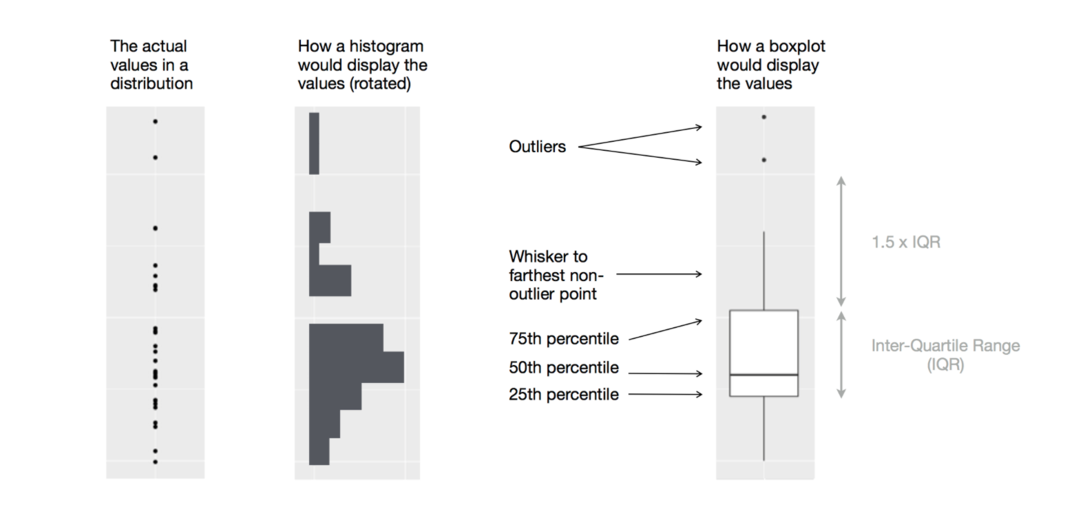
Diagram illustrating how a boxplot is constructed (Source: R for Data Science (Wickham, Çetinkaya-Rundel, and Grolemund 2023))

Example: Diamond Prices by Cut

  • Examine the distribution of diamond prices by cut. What do you observe?
ggplot(data = diamonds, mapping = aes(x = cut, y = price)) +
  geom_boxplot()
  • This suggests the counterintuitive finding that higher-quality diamonds are cheaper on average. Why might this be the case?

Example: Highway Mileage by Vehicle Class

  • Consider the mpg dataset. We want to understand how highway mileage (hwy) varies across vehicle classes (class)
  • To make patterns easier to see, reorder class by the median of hwy using reorder(..., FUN = median)
  • For long variable names, geom_boxplot() may be clearer when flipped using coord_flip()
ggplot(data = mpg) +
  geom_boxplot(mapping = aes(x = reorder(class, hwy, FUN = median), y = hwy)) #+
#  coord_flip()

Two Categorical Variables

  • To visualise covariation between categorical variables, count the number of observations for each combination.
  • One approach is to use geom_count()
ggplot(data = diamonds) +
  geom_count(mapping = aes(x = cut, y = color))

Example: Computing Counts with dplyr

  • Another approach is to compute counts using dplyr
diamonds %>% 
  count(color, cut)

Example: Visualising Counts with geom_tile()

  • Then visualise the counts using geom_tile() with the fill aesthetic
diamonds %>% 
  count(color, cut) %>%  
  ggplot(mapping = aes(x = color, y = cut)) +
    geom_tile(mapping = aes(fill = n))

Two Continuous Variables

  • A common way to visualise the covariation between two continuous variables is a scatter plot using geom_point()
  • Covariation appears as patterns in the points
  • Example: visualise the relationship between carat size and price of diamonds
ggplot(data = diamonds) +
  geom_point(mapping = aes(x = carat, y = price))

Other Ways to Visualise the Relationship

  • Use the alpha aesthetic to add transparency
  • Use geom_bin2d() or geom_hex() to bin observations in two dimensions
  • Bin one continuous variable so that it behaves like a categorical variable

Example: Add Transparency

ggplot(data = diamonds) + 
  geom_point(mapping = aes(x = carat, y = price), alpha = 1 / 100)

From Data Patterns to Models

  • Patterns in your data provide clues about relationships
  • Models are tools for extracting and formalising these patterns

References

Wickham, Hadley, Mine Çetinkaya-Rundel, and Garrett Grolemund. 2023. R for Data Science: Import, Tidy, Transform, Visualize, and Model Data. 2nd ed. O’Reilly Media.