The goal of this lecture is to help you become comfortable “talking to your data”: asking simple visual questions, checking for problems, and building intuition before fitting formal models
You should come away with a small toolkit of plots and ggplot2 patterns that you can reuse in many different actuarial and business contexts
Learning Objectives (continued)
Understand how to perform exploratory data analysis using the tidyverse package in R
Explore features of the data using visualisation
Identify common data issues, including:
missing values, unreliable/non-validated data, outliers, high-cardinality features
Apply appropriate methods to address common data problems
Assess data quality using a range of techniques
Use R for data manipulation (e.g. filter, merge, sort, group, summarise)
Import, export and tidy data in R
Use R Markdown for communication and reproducible analysis
Exploratory Data Analysis: An Introduction
Exploratory Data Analysis (EDA)
A set of procedures to produce descriptive and graphical summaries of data
Explore the data as they are, without making strong modelling assumptions
Examine the data to understand relationships among variables
Detect potential problems in the dataset (e.g. outliers, missingness, miscoding)
Check whether your question can realistically be answered using the available data
Develop a first, rough sketch of the answer to your question, which can then be refined with more formal models
The Process of Exploratory Data Analysis
EDA is an iterative cycle. You:
Formulate your question
Search for answers by
Collecting and importing data
Checking data quality and cleaning data
Manipulating and transforming data
Visualising data
Use what you learn to refine your questions and/or generate new questions
Data Visualisation is arguably the most important tool for EDA
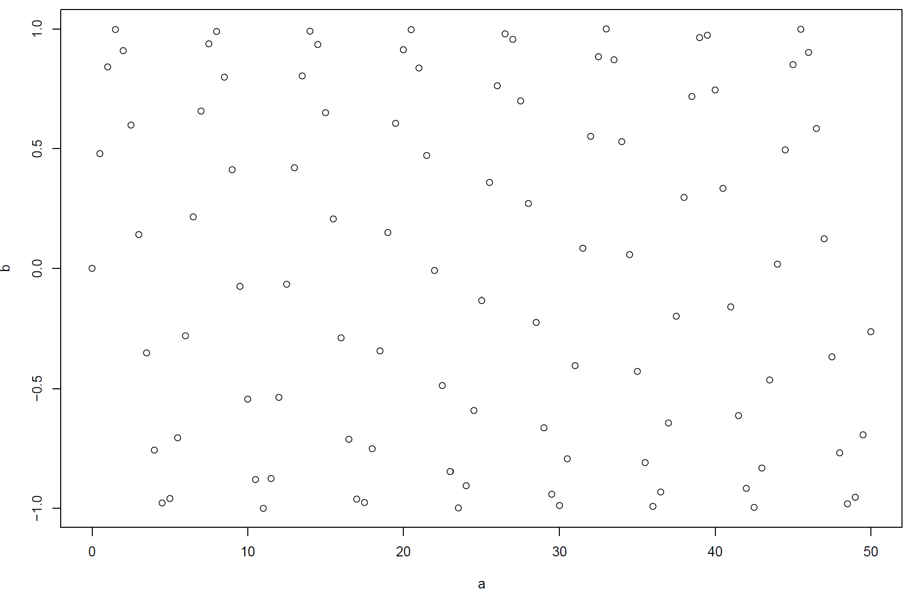
Seeing Patterns in Data
What patterns can you see in this plot?
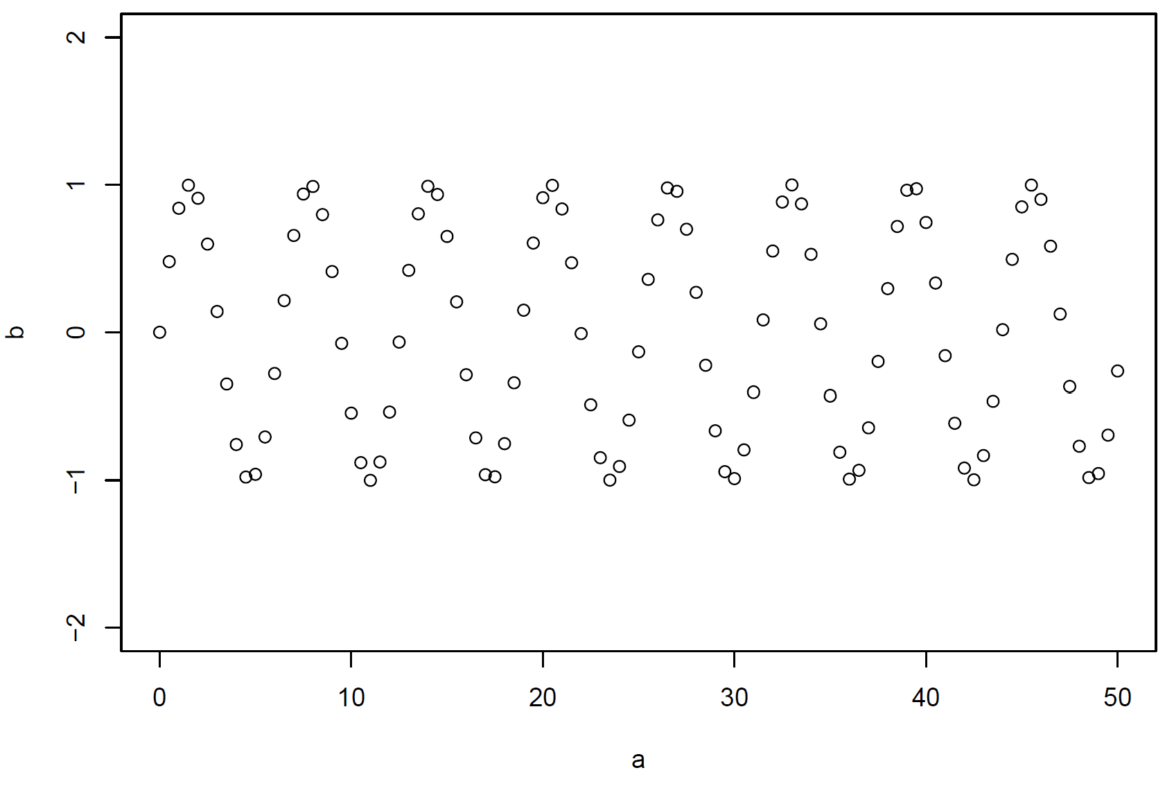
Seeing Patterns in Data (continued)
What patterns can you see in this plot?
Data Visualization
“Visually attractive graphics also gather their power from content and interpretations beyond the immediate display of some numbers. The best graphics are about the useful and important, about life and death, about the universe. Beautiful graphics do not traffic with the trivial.”
Warning: package 'tidyverse' was built under R version 4.1.3
Warning: package 'tibble' was built under R version 4.1.3
Warning: package 'tidyr' was built under R version 4.1.3
Warning: package 'readr' was built under R version 4.1.3
Warning: package 'forcats' was built under R version 4.1.3
Warning: package 'lubridate' was built under R version 4.1.3
-- Attaching core tidyverse packages ------------------------ tidyverse 2.0.0 --
v dplyr     1.1.1     v readr     2.1.4
v forcats   1.0.0     v stringr   1.5.1
v ggplot2   4.0.2     v tibble    3.2.1
v lubridate 1.9.2     v tidyr     1.3.0
v purrr     1.0.2
-- Conflicts ------------------------------------------ tidyverse_conflicts() --
x dplyr::filter() masks stats::filter()
x dplyr::lag()    masks stats::lag()
i Use the conflicted package (<http://conflicted.r-lib.org/>) to force all conflicts to become errors
Reload the package every time you start a new session
Use package::function() to call functions explicitly, e.g. ggplot2::ggplot()
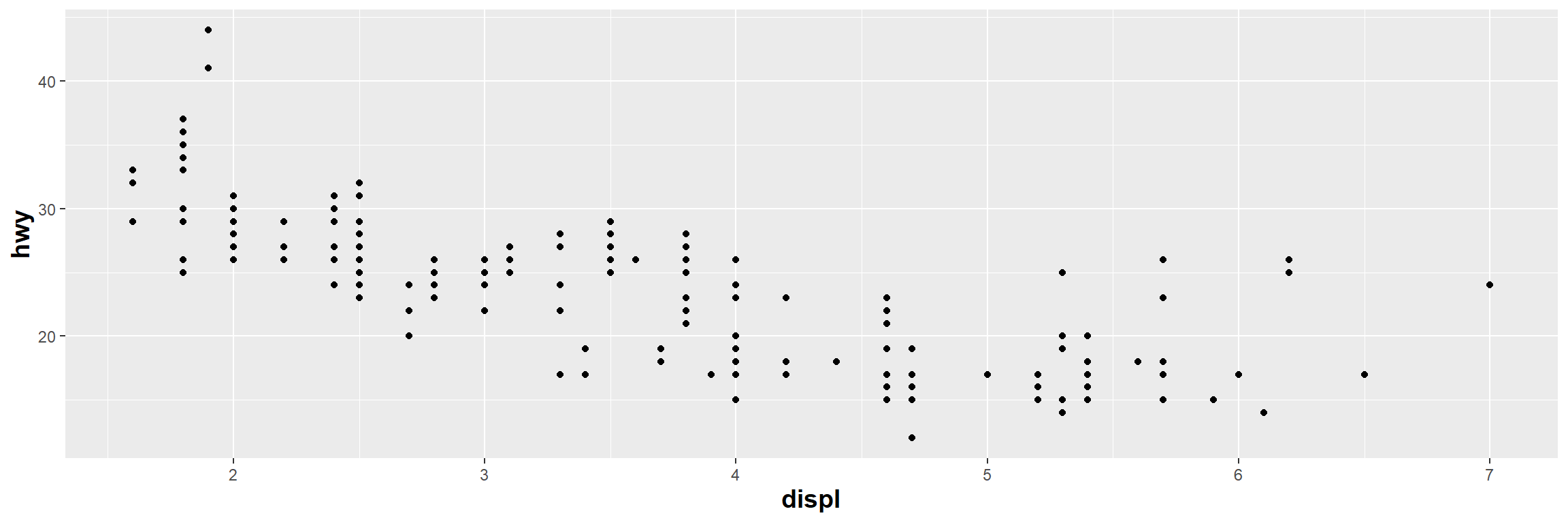
A First Visualisation Question: The mpg Dataset
Question: Do cars with larger engines use more fuel than cars with small engines?
Data: the mpg data frame in ggplot2 (ggplot2::mpg)
mpg contains observations collected by the US Environmental Protection Agency on 38 popular models of cars from 1999 to 2008
The data frame has 234 rows and 11 variables
A First Visualisation Question: The mpg Dataset (continued)
Variables:
manufacturer: manufacturer name
model: model name
displ: engine displacement, in litres
year: year of manufacture
cyl: number of cylinders
trans: type of transmission
drv: type of drive train, where f = front-wheel drive, r = rear wheel drive, 4 = four-wheel drive
ggplot(data = mpg) +# the dataset aes(x = displ) +# the x positionaes(y = hwy) +# the y positiongeom_point() +# the point geometric shape # Adjust axis titles' front sizetheme(axis.title=element_text(size=14,face="bold"))
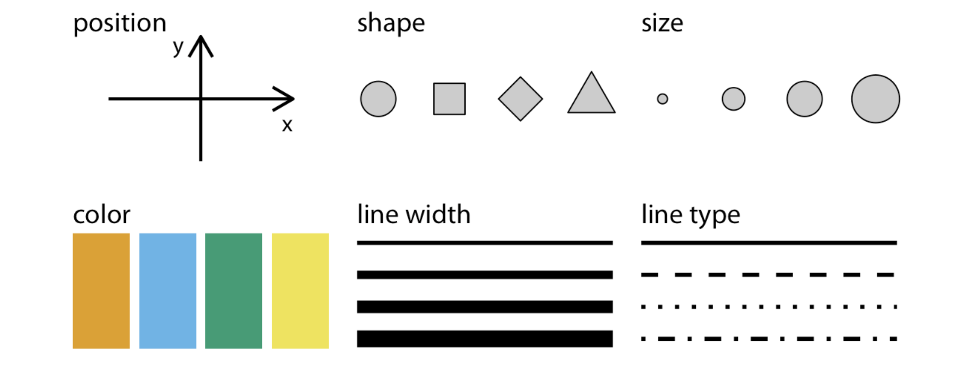
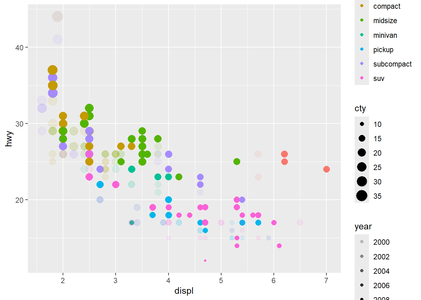
mpg_plot=ggplot(data = mpg) +# the dataset aes(x = displ) +# the x positionaes(y = hwy) +# the y positiongeom_point() +#the point geometric shape, the above aes are required and#the below are optional#theme(axis.title=element_text(size=14,face="bold"))+aes(colour = class) +# colour for type of car#aes(shape = class) +#ggplot2 will only use six shapes at a time. By default, #additional groups will go unplotted when using 'shape'.aes(size = cty) +# Size for city miles per gallonaes(alpha = year) # transparency for year of manufacture
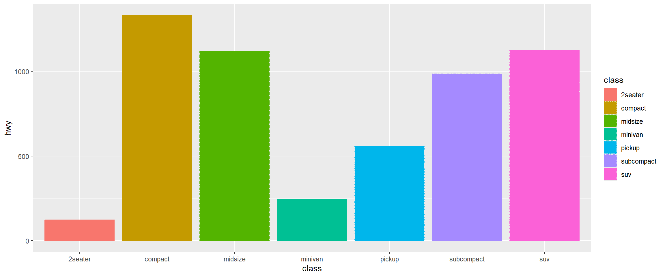
Different geometric objects use different aesthetic properties. For example, column plots often use fill to distinguish groups.
mpg %>%# data piped intoggplot() +# initiating plotaes(x = class) +#categorical variable aes(y = hwy) +geom_col() +#Use `geom_col` to create a column geometryaes(colour = class) +aes(fill = class) +# new aes 'fill'aes(linetype = class) #new aes 'linetype'
Unmapped Aesthetics
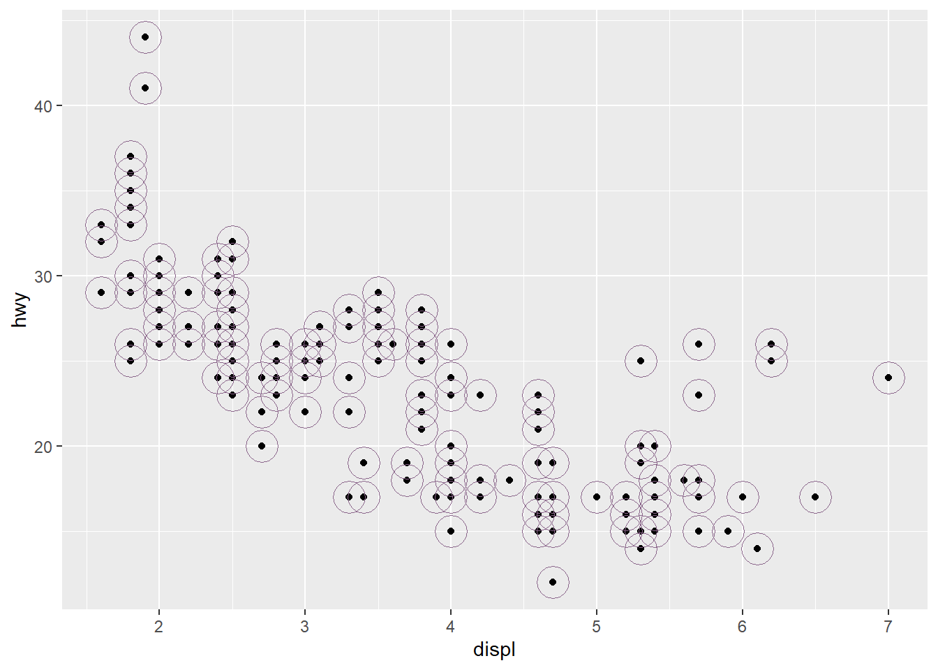
# Create scatter plot with base layermpg_plot <-ggplot(data = mpg) +aes(x = displ, y = hwy) +geom_point() +# Add another point layer with fixed (unmapped) aesthetics# These aesthetics don't represent variables - they're constant valuesgeom_point(colour ="plum4", # Fixed colour for all points in this layersize =8, # Fixed size for all pointsshape =21# Fixed shape (filled circle) )
Plot: Unmapped Aesthetics
print(mpg_plot)
Exercises: Aesthetic Mappings
Look at the help for geom_text (?geom_text). What are the required aesthetics?
Which variables in mpgare categorical, and which are continuous? (Hint: use ?mpg to read the dataset documentation). How can you identify this when you run mpg?
Map a continuous variable to colour, size, and shape. How do these aesthetics behave differently for categorical versus continuous variables?
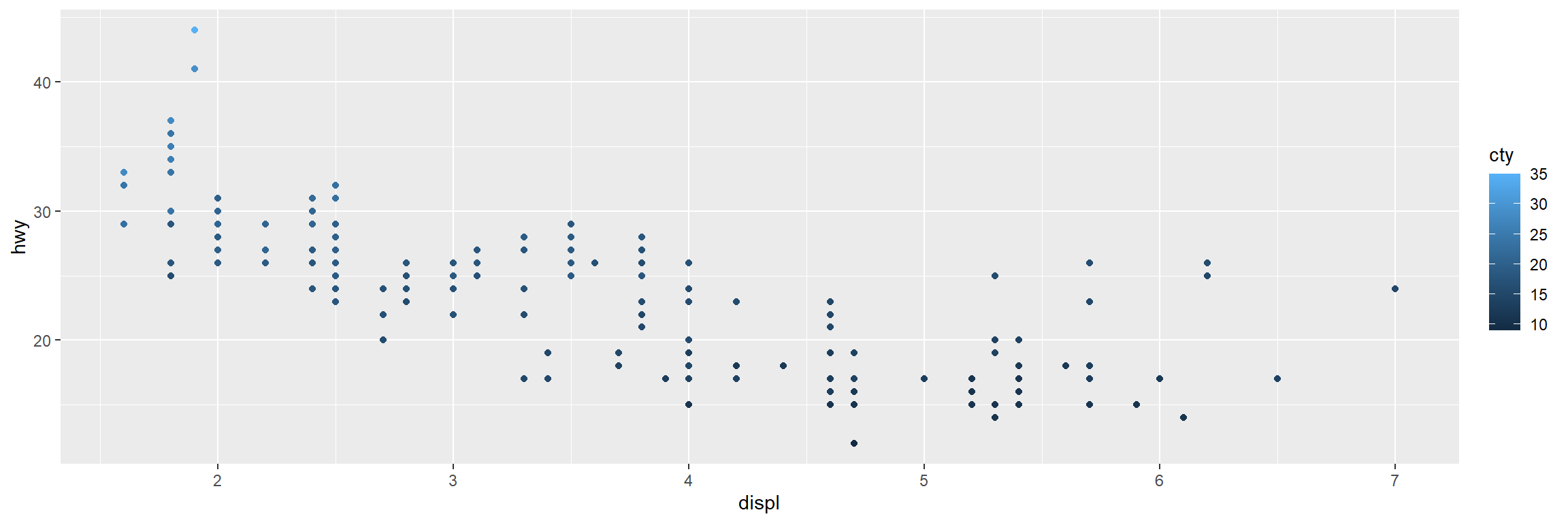
ggplot(data = mpg) +# the dataset aes(x = displ) +# the x positionaes(y = hwy) +aes(colour = cty)+#colour, size and shape# the y positiongeom_point() # the point geometric shape
Facets
Using facet_wrap()
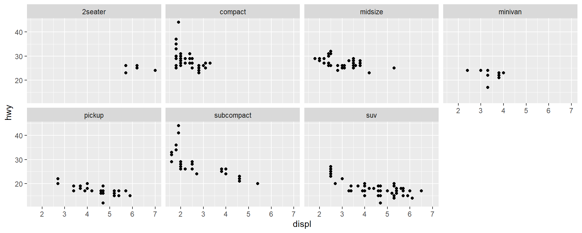
Facet your plot by a single variable
ggplot(data = mpg) +geom_point(mapping =aes(x = displ, y = hwy)) +# ~ followed by a discrete variablefacet_wrap(~ class, nrow =2)
Using facet_grid()
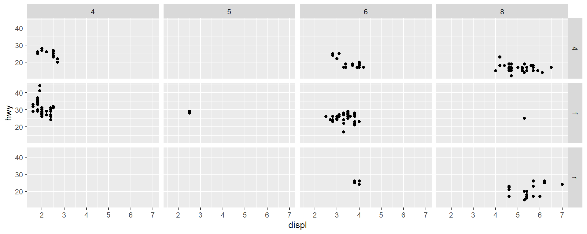
Facet your plot by the combination of two variables
ggplot(data = mpg) +geom_point(mapping =aes(x = displ, y = hwy)) +# two variable names separated by a ~facet_grid(drv ~ cyl)
  #facet_grid(. ~ cyl) #not facet in the rows
  #facet_grid(drv~.) #not facet in the rows
Warning: package 'gridExtra' was built under R version 4.1.3
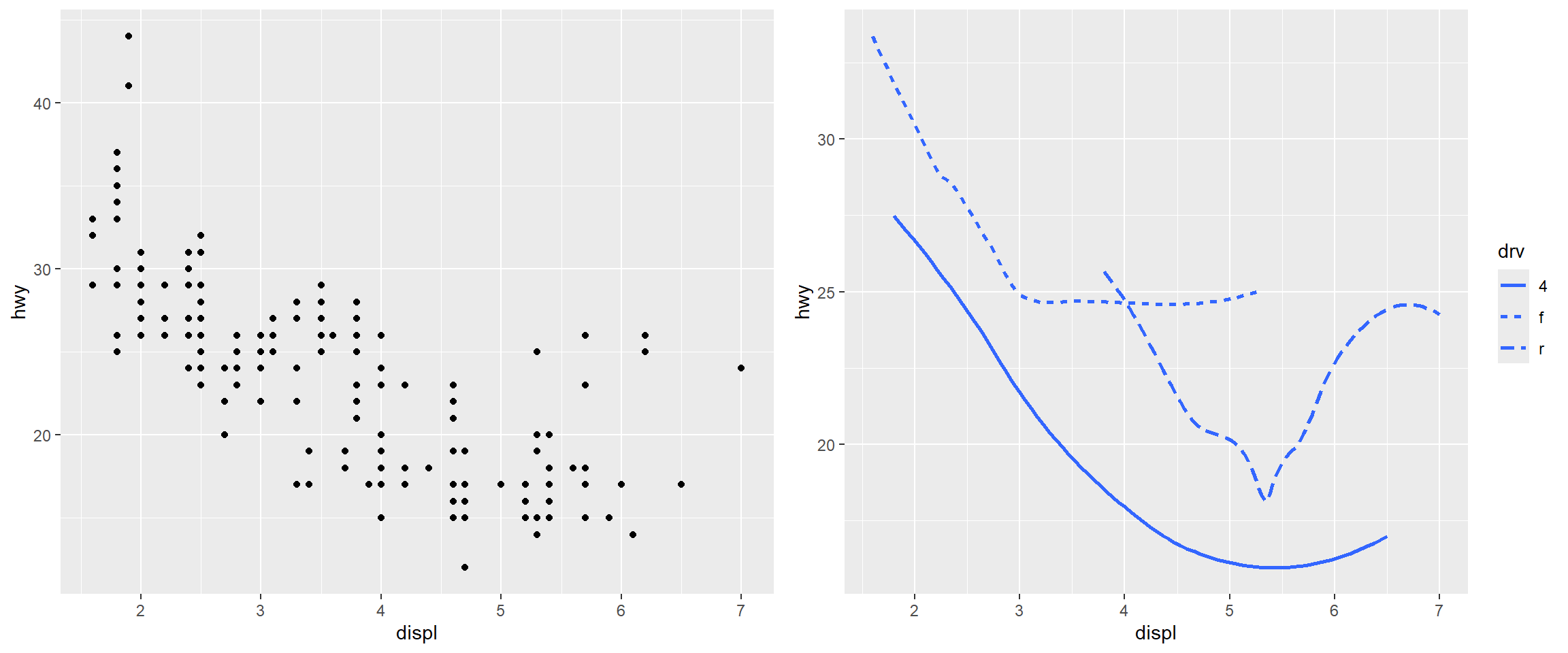
# Create scatter plot with pointsscatter_plot <-ggplot(data = mpg) +geom_point(mapping =aes(x = displ, y = hwy))# Create smooth line plot with different linetypes by drive typesmooth_plot <-ggplot(data = mpg) +geom_smooth(mapping =aes(x = displ, y = hwy, linetype = drv), se =FALSE)# Arrange both plots side by sidegrid.arrange(scatter_plot, smooth_plot, ncol =2)
Example: Boxplots
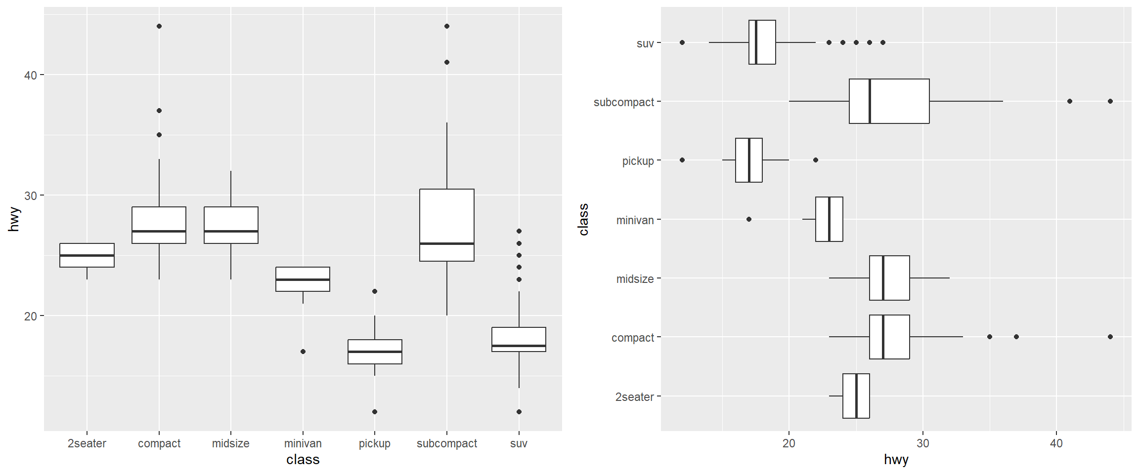
# Boxplot with default orientation (vertical)boxplot_vertical <-ggplot(data = mpg, mapping =aes(x = class, y = hwy)) +geom_boxplot()# Boxplot with flipped axes (horizontal)boxplot_horizontal <-ggplot(data = mpg, mapping =aes(x = class, y = hwy)) +geom_boxplot() +coord_flip() # switches the x and y axes# Arrange both plots side by side for comparisongrid.arrange(boxplot_vertical, boxplot_horizontal, ncol =2)
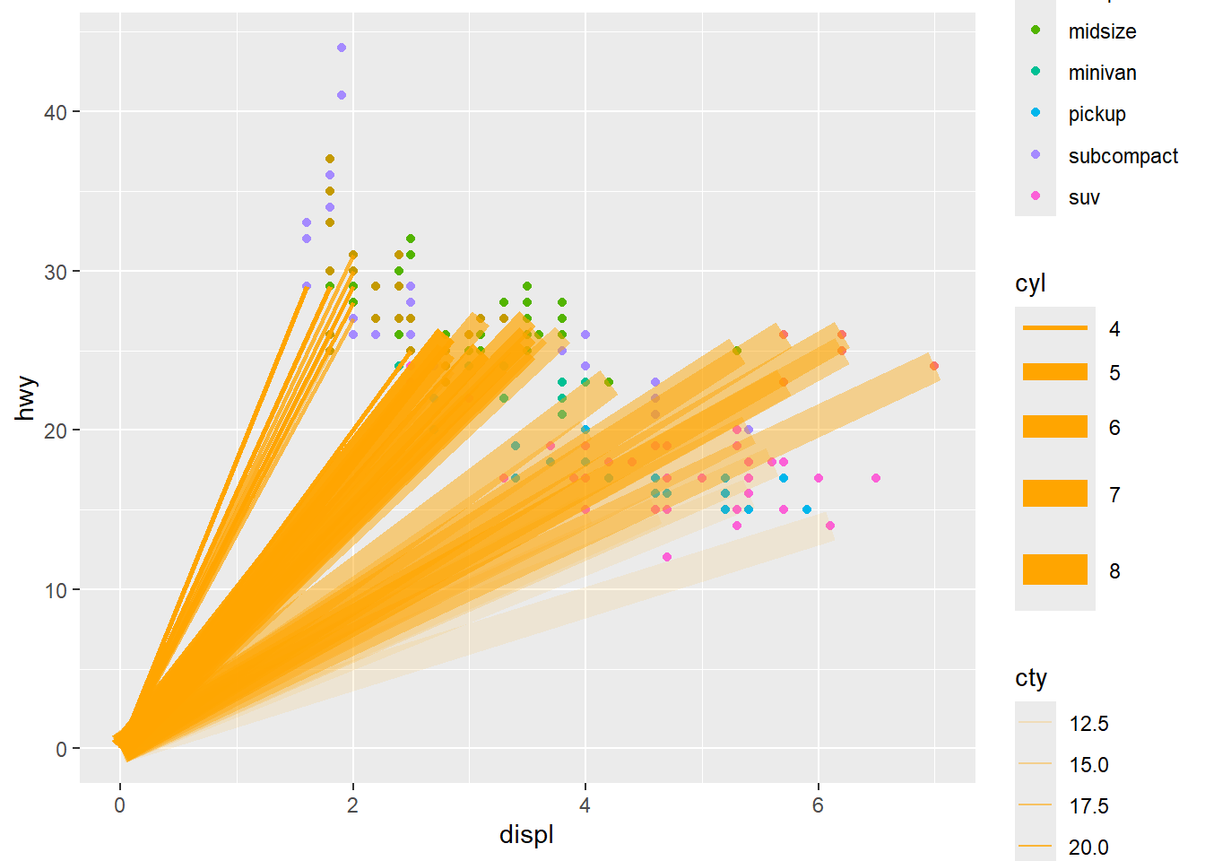
Local Data and Aesthetic Mappings
# Create base scatter plot with global aestheticsmpg_plot <-ggplot(data = mpg) +aes(x = displ, y = hwy) +geom_point() +aes(colour = class) +# xend and yend are required for geom_segment# Set endpoints to origin (0, 0) for all segmentsaes(xend =0, yend =0) +# Add segments layer with local data and aesthetics# geom_segment() draws a straight line between points (x, y) and (xend, yend)geom_segment(# Use local data: only flights with premium fuel (fl == "p")data =subset(mpg, fl =="p"), # Local aesthetics: size mapped to cylinders, alpha to city mpgaes(size = cyl, alpha = cty), colour ="orange"# Fixed colour for all segments )
Warning: Using `size` aesthetic for lines was deprecated in ggplot2 3.4.0.
i Please use `linewidth` instead.
Result: Local Data and Aesthetic Mappings
print(mpg_plot)
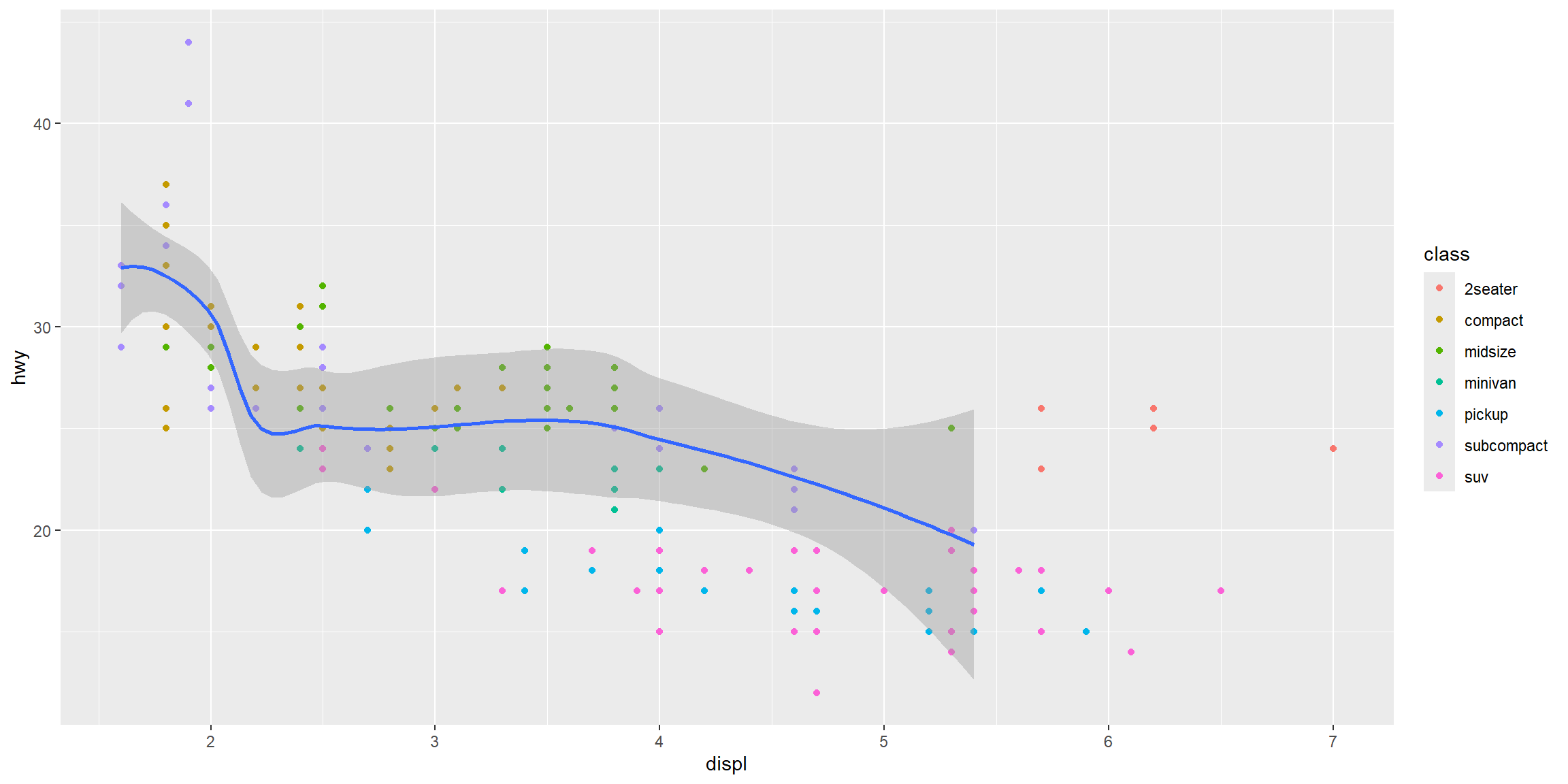
Example: Local Aesthetic Mappings
ggplot(data = mpg, mapping =aes(x = displ, y = hwy)) +#global aesgeom_point(mapping =aes(colour = class)) +#local aes#local data and aesgeom_smooth(data =filter(mpg, class =="subcompact"), se =TRUE) #se: standard error
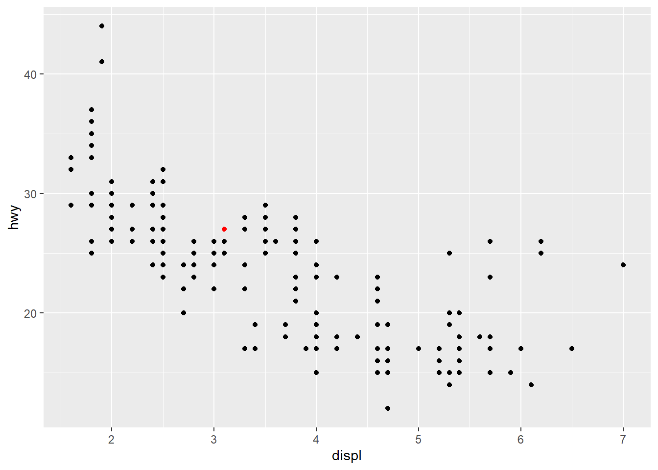
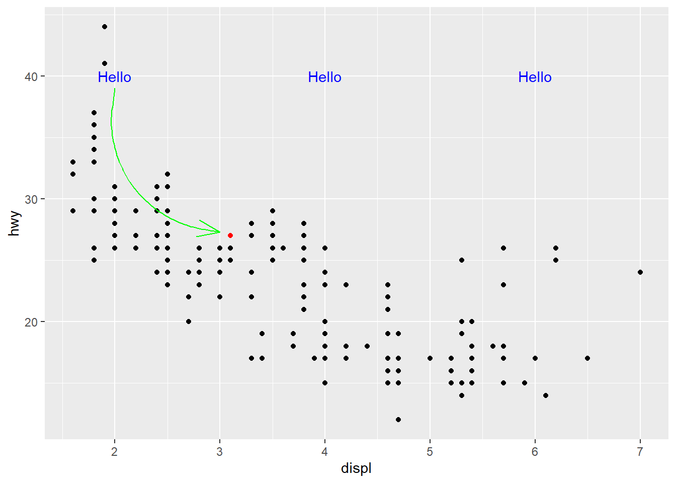
Annotation: Highlighting a Point
# Create base scatter plotmpg_plot <-ggplot(data = mpg) +aes(x = displ, y = hwy) +geom_point() +# Add annotation: highlight a specific pointannotate(geom ="point",x =3.1, # x-coordinate of highlighted pointy =27, # y-coordinate of highlighted pointcolour ="red")
Result: Highlighting a Point
print(mpg_plot)
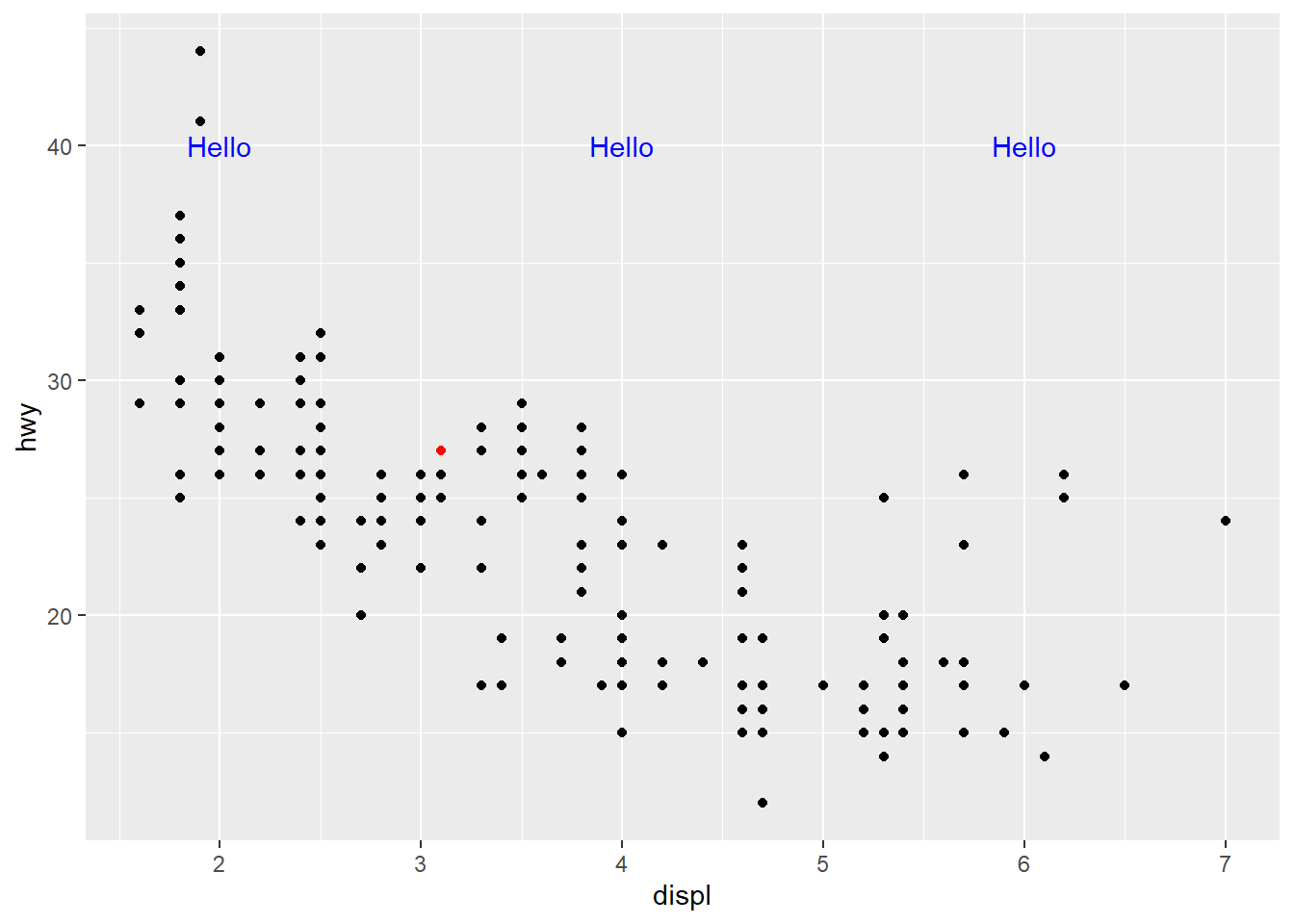
Annotation: Adding Text
# Create base scatter plotmpg_plot <-ggplot(data = mpg) +aes(x = displ, y = hwy) +geom_point() +# Add highlighted point annotationannotate(geom ="point",x =3.1, y =27,colour ="red") +# Add text annotations at multiple locationsannotate(geom ="text",x =c(2, 4, 6), # Multiple x-coordinatesy =40, # Single y-coordinate (text appears at same height)label ="Hello",colour ="blue")
Result: Adding Text
print(mpg_plot)
Annotation: Adding a Curved Arrow
# Create base scatter plotmpg_plot <-ggplot(data = mpg) +aes(x = displ, y = hwy) +geom_point() +# Highlight a specific pointannotate(geom ="point",x =3.1, y =27,colour ="red") +# Add text labelsannotate(geom ="text",x =c(2, 4, 6), y =40,label ="Hello",colour ="blue") +# Add curved arrow connecting text to pointannotate(geom ="curve",x =2, y =39, # Starting point of arrowxend =3, yend =27.3, # Ending point of arrowcolour ="green",arrow =arrow(angle =20)) # Arrow head angle
Result: Adding a Curved Arrow
print(mpg_plot)
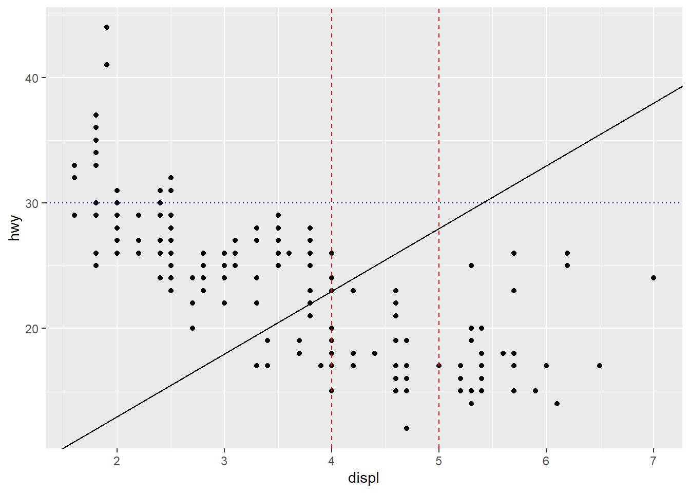
Annotation: Adding Reference Lines
use geom_abline, geom_hline, and geom_vline
# Create base scatter plotmpg_plot <-ggplot(data = mpg) +aes(x = displ, y = hwy) +geom_point() +# Add reference linesgeom_abline(slope =5, intercept =3) +# Diagonal line: y = 5x + 3geom_hline(yintercept =30, # Horizontal line at y = 30linetype ="dotted", colour ="blue") +geom_vline(xintercept =c(4, 5), # Vertical lines at x = 4 and x = 5linetype ="dashed", colour ="red")
Result: Adding Reference Lines
print(mpg_plot)
Exercises: Aesthetics and Annotations
What has gone wrong with this code? Why are the points not blue?
What happens if you map an aesthetic to something other than a variable name, e.g. aes(colour = displ < 5)? Note: you will also need to specify x and y.
Interactive Data Visualisation (Optional Extension)
Can embed apps in R Markdown documents or build dashboards
References
Wickham, Hadley, Mine Çetinkaya-Rundel, and Garrett Grolemund. 2023. R for Data Science: Import, Tidy, Transform, Visualize, and Model Data. 2nd ed. O’Reilly Media.
Wilke, Claus O. 2019. Fundamentals of Data Visualization: A Primer on Making Informative and Compelling Figures. O’Reilly Media.